I'm going to try a little experiment with this post and see how the different fonts translate into the mobile version of people's phones and tablets (I had a really hard time picking 4 other fonts, especially the 4th paragraph, I want sans serif but most of them are just boring with zero character) starting with Comic Sans, then Ariel, Avenir Medium, Cochin, Chalkboard, and the last sentence back to Comic Sans.
This was supposed to be included in my last post but somehow got overlooked...When we left Wharton to head to San Antonio on Saturday we took county roads until we hit I-10, 102 to 3013 back to 102. It's a really nice drive especially the last section of 102 when you start getting into the hill country. There was a stretch of 3013 before we got to Eagle Lake that had thousands and thousands of starlings hanging out in the early morning light just before the sun rose above the horizon. There were many small groups flying their murmurations, even larger groups converged on the power lines and twice we came to a huge group covering the roadway so densely that a good 15 or 20 feet looked black. We'd get almost upon them before they took flight. No picture though, it all happened so fast.
Wednesday I decided to add another layer of the background color so had to build up a little barrier with clear around the edges of the design elements to prevent the background color, olive smoke again, from spilling over into the other colors, wouldn't have mattered with the green but might have altered the moth color, and then filled in with clear over the other colors.

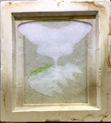
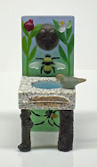
I also added a solid layer of clear over the whole thing, did all my math and still need to add the final two layers of clear and white. But as I feared/expected I don't have enough white to insure a good solid layer. The amount I have is borderline so I've ordered more white but I'm having trouble getting it as the manufacturer has been out for a while now and so the distributors that ship are also out. I ordered 4 pounds from one place but all they can send me right now is two, their last two pounds of plain white. There are other whites...opaque white, dense white, reactive white, translucent white...and those are available but not what I want. So now I'm waiting for my glass to arrive to finish filling that mold and getting it into the kiln. In the meantime I'm going to work on painting the shadowboxes my brother made for me and getting the trumpet flower panels installed in them. Once the luna moth mold is in the kiln I'll start on the two new models I have planned.
I got almost nothing accomplished the past two days, Thursdays being my SHARE day and yesterday being one of my days to fix dinner so I took the dog for a long walk after lunch since the weather has been temperate and then we watched two episodes of The Witcher on Netflix before I started on dinner which was stuffed shells from a recipe I got off the internet. It made a lot, enough to serve 10 people (there's just two of us) but all the recipes I looked at were basically the same. I don't think I'll ever use that recipe again (in fact I may never have to make stuffed shells again ever), total overkill on the cheese...2 pounds of ricotta, one pound of mozzarella, half pound of parmesan...and it was sort of weird as half the mozzarella and half the parmesan was mixed in with the sauce, also some sliced mushrooms. It filled two 8" baking dishes. We ate less than half of one and that was all we had. I lay there last night after I went to bed with dinner heavy in my stomach thinking I should have fixed a salad to go with to balance out all that cheese. And then, now that I have so much left over and divided up in the freezer, I realized I could have easily just divided the recipe. What was I thinking!
Obviously, I wasn't.


All the other fonts showed up as is on my phone, only Comic Sans went wacky. I don't understand why as Comic Sans is a common font. So vote for your preferred font and I guess I'll switch.
ReplyDeleteFirst paragraph is the most readable for me. Thanks for the opportunity to vote on it!
ReplyDeleteGood luck with your supplies. Such a drag being held up.
Goodness, yes that wass a lot of cheese.
ReplyDeleteSome of those fonts were easier to read than others on my computer. I vote for the 3rd, 4th, and 5th Paragraphs. The thir is number 1.
All the fonts look fine and readable to me. I also like the first paragraph font.
ReplyDeleteWe're noticing issues with the supply chain of goods here. Lots of store shelves have big empty spaces. It is a little bit worrisome.
Enjoy your sunshiny weather. We're in for a whole lot of rain for more than a week.
I had to chuckle at your last statement about splitting the recipe in half, but we never know that a recipe is going to be so huge when we first begin making it. We just follow the directions and voila! we have dinner (and lunch and dinner and lunch! LOL) I've only ever made stuffed shells one time and afterwards said it was too much work. I do like to eat them, just don't like to make them! Glad you're at least getting enough white glass to finish the moth...
ReplyDeleteI really like that next to the last paragraph font. Chalkboard? Nice.
ReplyDeleteYou forgot you could divide the recipe in half because your brain was still working on art-math. It couldn't be bothered with food math too!
On my phone, Comic Sans becomes that unreadable, over-fancy font. The second and third appear the same on my PC and phone (Firefox on PC, Safari on phone). I think #2 and #3 are the best, at least from my perspective. The cleaner the font, the more readable. I don't like Comic Sans even when it's unaltered, but I could live with it, since I mostly read on my pc anyway.
ReplyDeleteI did a double take when I read your route. 3013 is the road that goes right past the Attwater Prairie Chicken Preserve. The road in is a gravel/dirt combination, and the signs not hugely obvious, but it's there, on the west side of the road.
All fonts readable here. I'm on MacBook Pro.
ReplyDeleteAll those different fonts cause an interesting effect when you scan the post. I like the second font.
ReplyDeleteAny of those fonts work for me!
ReplyDeleteI can make any font work. Which one to use is entirely your call as far as I'm concerned!
ReplyDeleteAll the fonts are fine to me (but I'm reading on a PC). I'm sitting here eating my leftover oatmeal concoction & laughing at the too much cheese - this has parm, cheddar, and swiss in it (but just a slice each of the hard cheeses & maybe two TBLS of the parm). Your recipe DOES sound like a lot of cheese. But I always have to make it at least once as written before I fiddle with it.
ReplyDelete