My
daughter picked the girls up Thursday evening and Friday I did
absolutely nothing...slept late, surfed the web, read...but Saturday
I got back to work on model making and finished the hummingbird tile
model for my friend. Sunday I polished it up

and
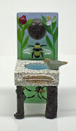
then decided to finish the flower with bee I had started nearly a
year ago. The flower was roughed out and then I decided it was too
thin in places so I beefed it up and everything was going fine until
I started work on the center of the flower and getting the previously
prepared bee positioned when it just all went to shit. The wax was
too soft, my fingernails were too long and I kept gouging the petals
of the flower, I didn't like the way anything looked, getting more
and more aggravated until I finally got up and cut my nails back
nearly to the quick and smushed the bee and took out the stamens and
smushed them too. I got another wax bee out of the reproduction mold
and started trimming it back but then it was time to go to yoga so I
put it aside for later.

poor
bee has no legs
What
I learned, I think, is that I'm done with this design...single flower
with bee on a leaf. This is the fifth time I've done this one though
they are all a little different and the flowers are all different
colors. I'll finish this one eventually but it will probably be the
last one. Not the last bee/flower piece but the last like this.
Probably. We'll see.

Trying
out the color samples of paint for the outside of the house didn't
help my aggravation any. I finally went and got the paint samples for
the other colors yesterday and tried them out and I don't like any
of them! The blue that is so
blue in the little bathroom is surprisingly pale on the side of the
house, the purple is too purple,
and the reddish/orange is too intense. Then I tried out the other two
blues from when I was trying colors for the back bedroom. Basically,
I'm back to square one on colors.

I
don't know, maybe some of it is growing on me
So
yoga last night and I arrived highly aggravated, or 'sparky' as Abby
phrased it, but by the end of the class had relaxed yay
yoga and drove around looking at
boring dull uninspired paint jobs on houses on my way home.


The hummingbird looks lovely and I love the bees too - wish I'd had them as models for when I was carving! I'm thinking of you savaging your nails and smushing! (great word)
ReplyDeletebee on flower so lovely!! Wonderful design. Paint on houses here are as dull and gloomy as the weather. I understand your trouble choosing color. The paint expert told me that blues are the most difficult and do not wear well, Gold colors are also difficult but last a lot longer.
ReplyDeleteLove the blue flower and bee and I am glad you are trying out the colors on house first. I can never get the color right inside or out. I think the one with the most gray in it is good, but it is your preference. The lady across the street just painted her house. The brick is pink and she said she was going to paint the wood gray, but it is blue. It is an eyesore and I would have done it over again. Keep trying till you get what you want. It is better in the long run to get it like you want it.
ReplyDeleteMy sister could straighten out your color problem in a minute. Always sending me back for more paint swatches, although we got better at it when when briefed Laura.
ReplyDeleteI've had warps like that flower/bee. Too many knots. So annoying.
Well, the bee was like the color, I think- you try and fiddle until you find what works and what you like. Until you are satisfied.
ReplyDeleteThat's a good word. Satisfied.
Have you thought about a green? I do love a dark green house with white trim. There's a house down the road that's a sort of gray/blue/green that is really lovely. Yellow can be a nice house color too.
I have thought about green. I do like a green house, my neighbor's is dark green with white trim. don't care for yellow though. now I'm thinking maybe a paler purple wall with the dark blue skirt or maybe more towards turquoise and perhaps a bit lighter coral.
Deleteand like the flower and bee. I think another reason I'm disenchanted with this current model is that the last one came out so fabulous that I don't think I can do better, or maybe even not as good.
DeletePicking out paint colors kicks up my anxiety, I think because I want it to be just perfect, whereas many other people are okay with "close enough." I like Mary's suggestion above, gray-green-blue sounds like an elegant color, especially set off by white trim. But then I might watch too much Fixer Upper. That is definitely a Chip and Jo exterior color.
ReplyDeleteBlue is my favourite colour so you have my vote for any of the shades!
ReplyDeleteMy neighbours painted their house a deep terracotta red last year and I wish we'd have the guts to follow. They are Dutch and the Dutch love painting their houses in strong colours (http://www.beechmontbaptist.org/things-not-netherlands/). But so do the Irish (https://journalistontherun.com/2012/08/14/the-deck-of-cards/). Maybe one day.
I love strong fun colors on other people's houses. part of my problem is getting the courage up to do it to my house.
Deletetake the color and start with the palest paint with that shade
ReplyDeleteI vote for red AND purple!
ReplyDelete