The
installation for the A&M panels was Friday and it went without a
hitch. I don't know why I was worried because these guys always do
an excellent job.
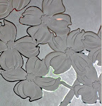
It was impossible to get good pictures of the individual panels. The sun was so bright and completely washed out the images in the photos. This was the best one I got.
Unfortunately,
it didn't go without a glitch. Turns out in one of the panels up
near the top in the clear area is a flaw in the plastic interlayer of
the laminated glass that escaped detection and if I had just placed
the pattern on the glass differently it would have been covered up by
the etching. It's not very big, maybe 1/2” x 3/8”, but in
certain lighting conditions it is visible and looks like a smudge.
And of course, the owner of the art consulting company was there to
oversee the installation and so she is aware of it and says it could
be a real problem. FUCK. Fuck fuck fuck.
I
don't want any problems. I just want to get paid and be done. We're
supposed to confab about it later today to see what, if anything, should be done about it. Personally, I'd rather just let it be.
People aren't going to be looking that high up, they are going to be
looking at the etching and they are going to get dirty so it won't be
the only smudge. The staff was already wondering if they were going
to be responsible for cleaning the glass or if maintenance was. I've
thought of a way to disguise it using the cream etch but worst case
scenario is they are going to want us to replace it. At this point
that's the last thing I want to do and not just because of the
expense.
And
if that wasn't enough to ruin my day, plus the fact that, let's face
it, once installed and the protective film removed, these panels
weren't our best work, yes I know I'm my own worst critic and yes
we were asked to reproduce photos instead of letting me design the
panels and yes we were working under conditions where we didn't have
the control we usually do but that doesn't make me feel any better
about the end result, as if all that wasn't enough, I missed one
of my turns on the way home and ended up about 24 miles in the wrong
direction before I figured it out and had to backtrack adding another
45 minutes to an already 2 hour drive.
I
managed to put it all out of my mind over the weekend but now I'm
here waiting to hear from the art consultant. This
is why I don't want to do etched glass anymore. I'm tired of the
problems and this job has been nothing but problems from the beginning.


Well- you're right in that this project has been one pain in your ass after another. And now, when it should just be done, you're having to worry and fret some more.
ReplyDeleteUgh.
I'm so sorry. But to the untrained eye, they look amazing!
well thanks. I'm hoping that the power that be will not notice it.
DeleteHopefully it will all work out
ReplyDeleteI'm sorry too Ellen. They look spectacular and then that little fly in the ointment. I'd put a big beautiful signature there or an emblem of A & M. No need to redo the whole thing. Tell them that is your cypher. That you meant to do that and don't charge extra or some little saying over it.
ReplyDeletethat was my thought, the A&M logo.
DeleteI hope they decide to leave it as is. The idea of removing them (to do whatever the consultant feels they might need) sounds... like a lot of work. Fingers crossed.
ReplyDeleteThey wouldn't need to be removed to use the cream etch so that's a plus.
DeleteMay the force be with you.
ReplyDeleteThe truth of the matter is, no one would notice it a month down the road. There's all that hyperattentiveness going on now that's a real pain. I hope it all works out, and you don't have to re-do it. I've had to do that, and I know what a pain it is.
ReplyDeletewell, so far I have heard nothing today after the initial response from my main contact at the art consultant that she felt like crap and was heading to the doctor and the other two women would have to deal with it.
DeleteI'm just amazed at how much work has gone into this - and I think they look great!
ReplyDeleteI like the A&M logo idea. This is why I hate commissions...sorry you're going through that.
ReplyDeleteThey look great to me. We artists are much more critical of our own work than others would ever be.
ReplyDeleteThese are lovely and I am impressed with the installers being able to handle such important works. You did a beautiful job and I am sure they will want to handle it in the least difficult process!
ReplyDeleteOh, yikes. I hope they just let it go. If not, I'd argue for the A&M logo too! (To me, those windows look FAB.)
ReplyDelete